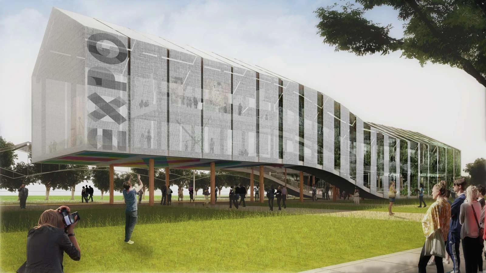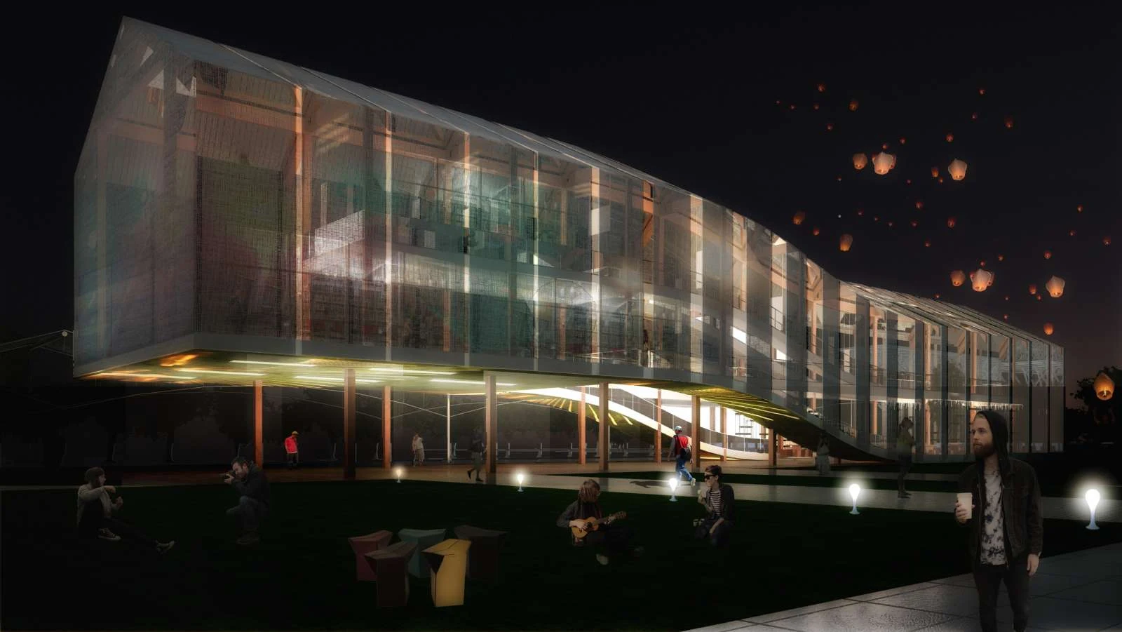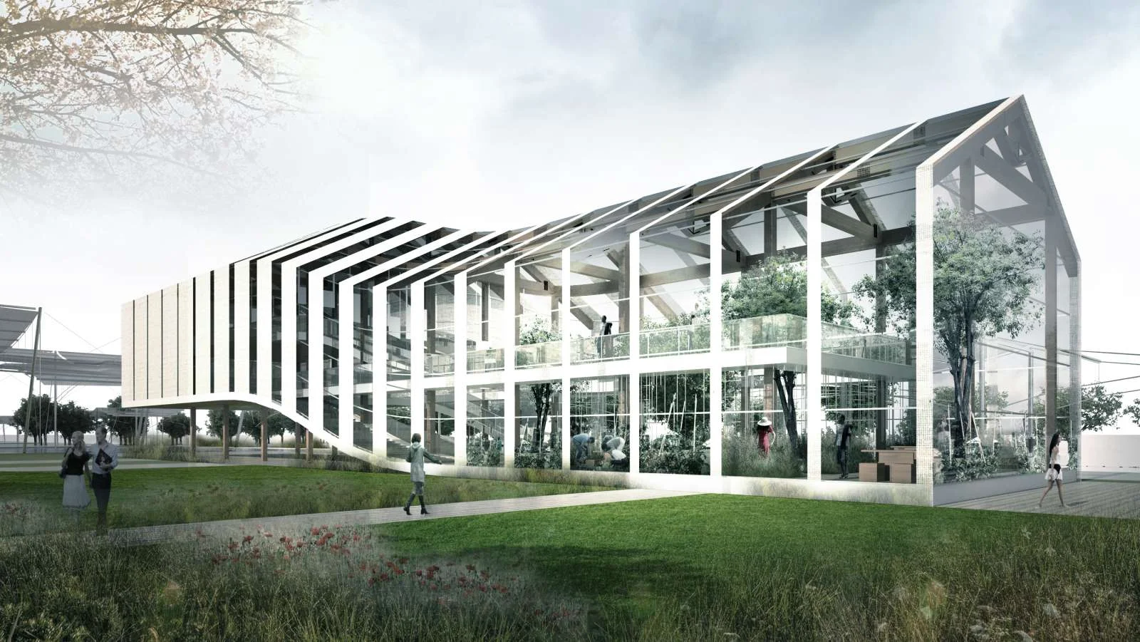
The main concept of the pavilion is to create two different spaces. One for the exhibition and another one for a big greenhouse. They are connected to allow people to walk in a unique single space.

The greenhouse is the place where people can pick up and eat food directly from the hortus. From an aesthetic point of view is used the typical shape of the Austrian wood house and of the greenhouse. the hortus is placed on the south side facing the sun. It is connected with the bar and restaurant in order to creating a place where people can easily eat the vegetables picked up by themselves.

The exhibition space is placed on the north side to avoid direct sunlight. Moreover this part of the pavilion is lifted up to allow the pedestrian flow on the area. the two spaces are similar in shape but totally different in their function. One is made in glass, lightened with natural light of the sun, and the other is covered with stoff material for a darker space where is possible to show panels of the exhibition and places for offices.

The two spaces are linked one to another with a facade that fade from dark to bright. the shape of the classic tilted roof house recall the typical mountain Austrian house and at the same time the greenhouse creating a very recognizable and iconic design. the path inside the pavilion is made in a way that people walk in a kind of loop, passing from the exhibition space to the greenhouse and from the greenhouse to the exhibition again.

In the pavilion the user feel very interactive since he is picking up food directly and eating in the same place. This fact shows the clear sustainable message of the self made food, genuine and controlled. the simple idea is to have a very iconic volume that symbolises Austria that works either for interactive and for educational purposes.

The “Rampant house” clearly show the message of how an architecture can really be sustainable, a space where food is selfmade, where natural light is controlled and where a dark and multimedia space is merged with social and open space for all the user.
Location: Milan, Italy Architect: Paolo Venturella Project Team: Fabrizio Furiassi, Manuel Tonati, Angelo Balducci Year: 2013 Images: wemage