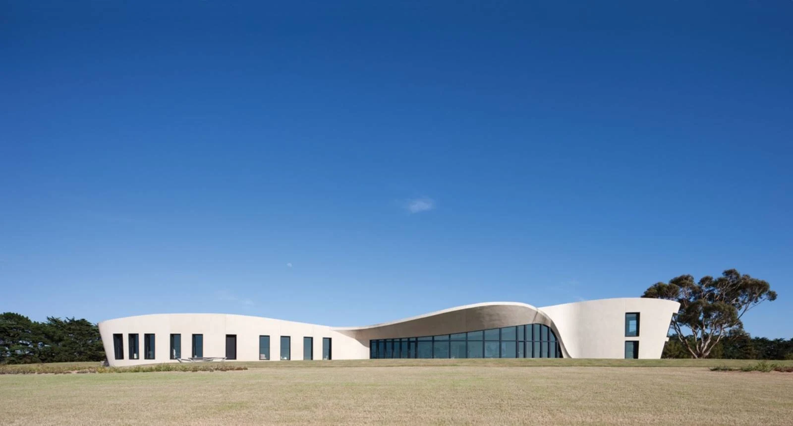
Flinders House is carefully sited at the crest of a hill and, like many Wood/Marsh projects, is unapologetic in its monumentality and deep connection with the earth. Roger Wood explains: “We wanted the house to seem like it had been here for many years and the earth had simply eroded away and exposed its form rather than being a new addition to the landscape. the building has a sense of permanence … it won’t get blown away.”
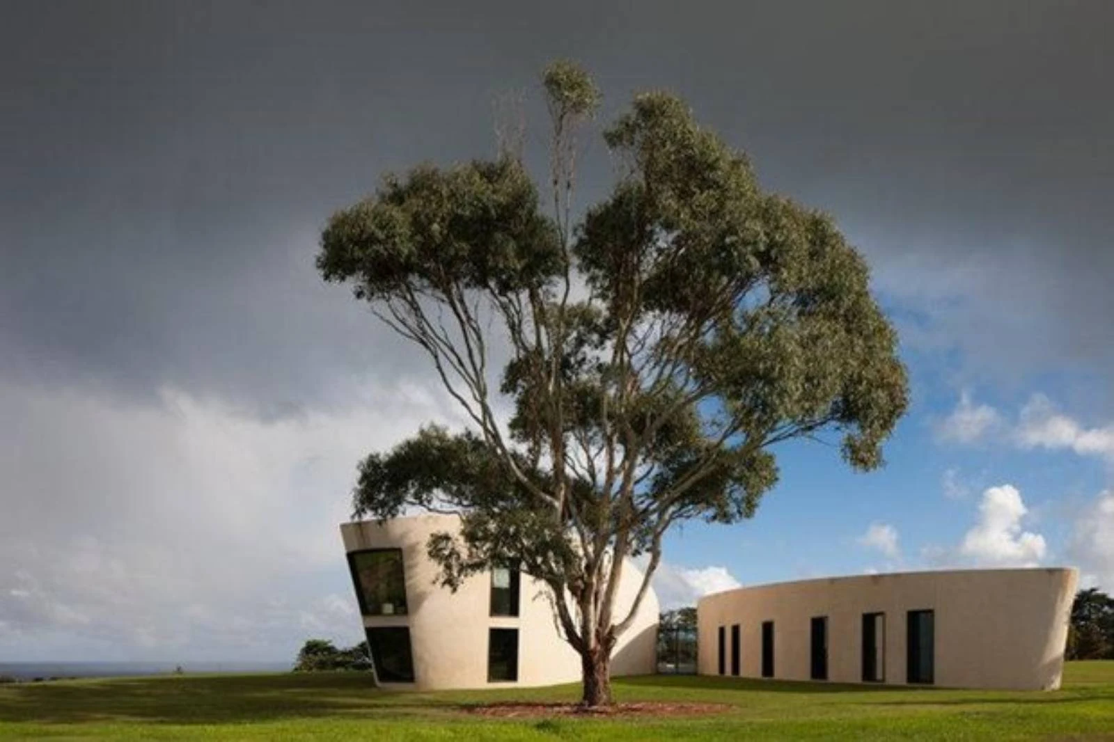
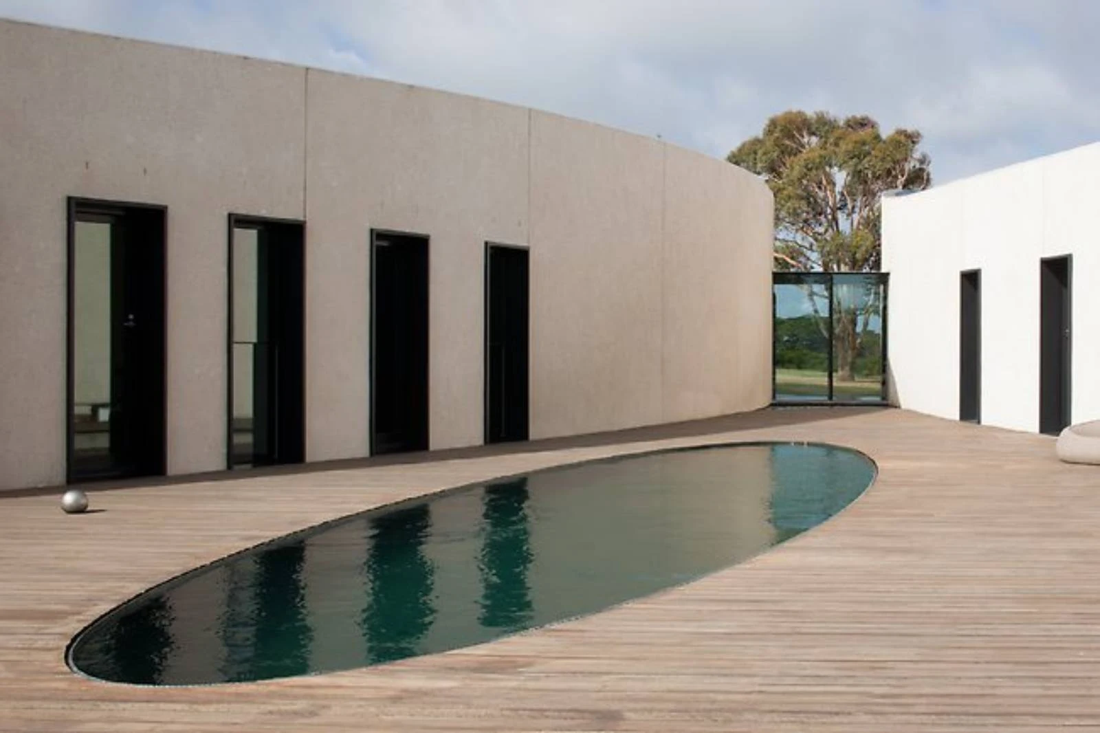
Composed as two wings in plan, the dwelling shifts dramatically as the geometries negotiate each other and the contours of the landscape. Its striking off-white, rendered form collects the eye and takes it along sweeping curves that shift in three dimensions. the eastern void between the wings is left open to reveal a jewel-like glass pavilion that bridges the solid forms and frames the view out to the western timber pool deck positioned to provide shelter from the prevailing winds.
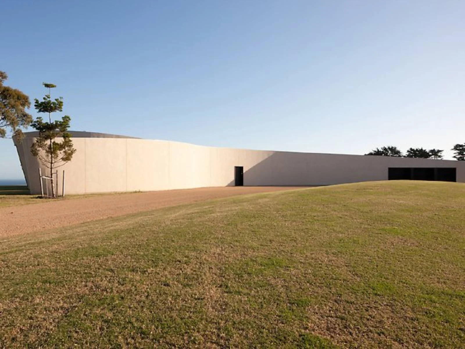
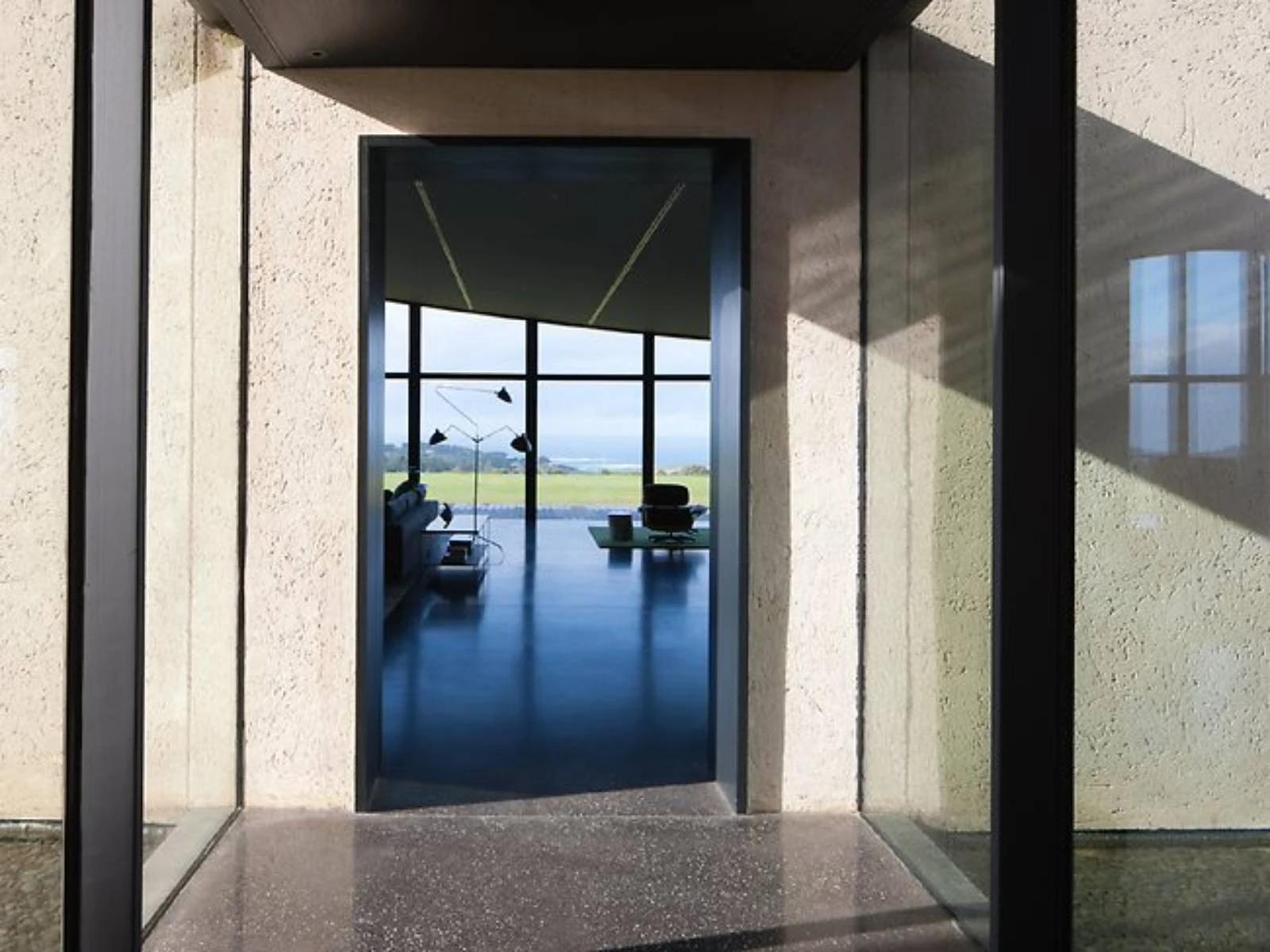
An oblique approach to the dwelling is created by a blank entry through a solitary black door within the sand-rendered wall. “On arrival, the house presents a threshold to move through and, at that point, the view is revealed to you – a similar theatrical device exists at Port Phillip Estate,” explains Wood. Once inside, the curving forms afford everyone a view of the ocean. This initial denial of visual access heightens the drama of the release into the axial panorama of the interior view, drawing the visitor into the huge volume that forms the main shared living zone of the dwelling.

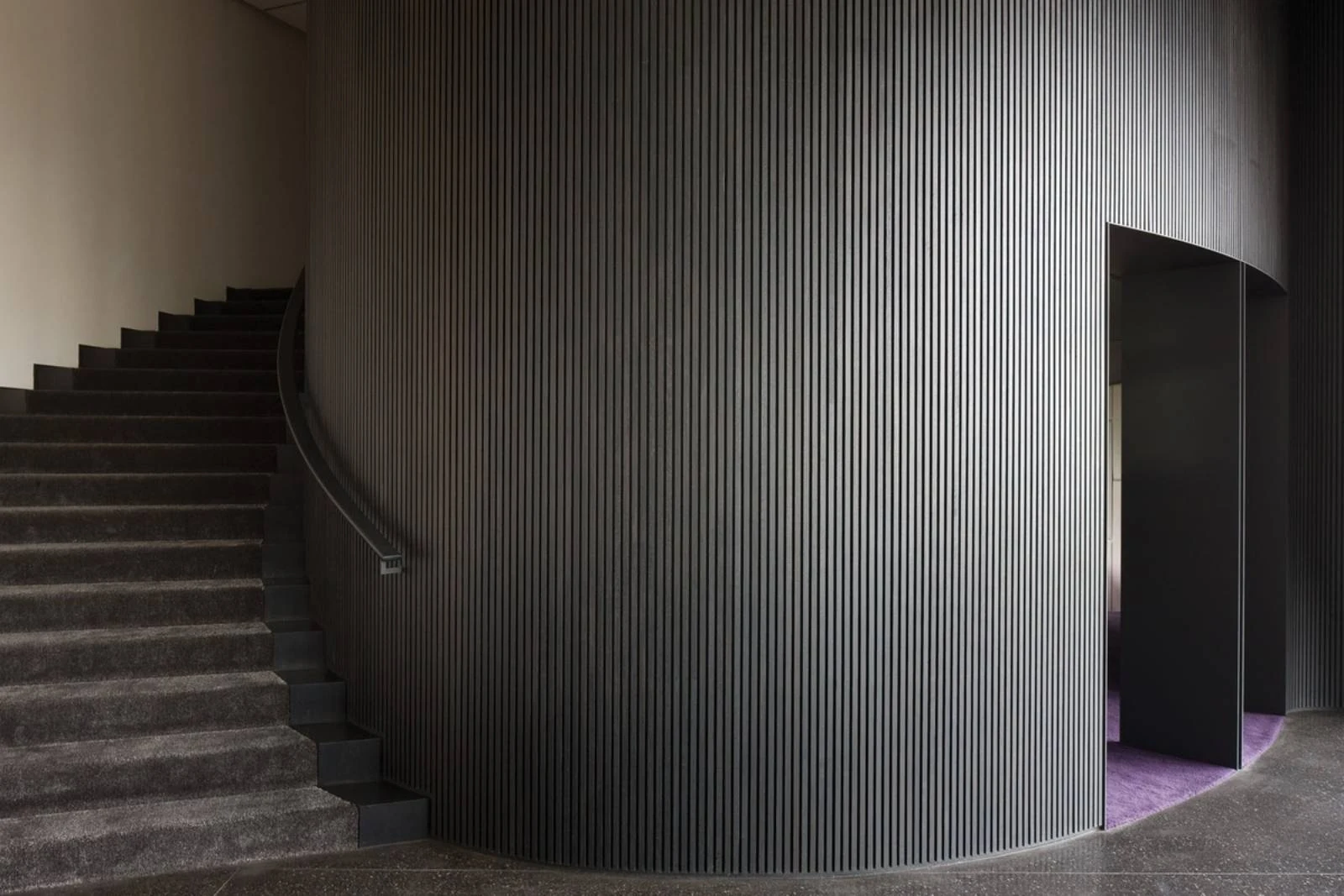
The height of this space is striking. the sweeping ceiling seeks to simultaneously compress and release the occupant through the view, and in section through the vast dimension of the volume. to the left lies a sweeping staircase – a Gone with the Wind-like gesture celebrated within the form – that climbs the wall to the main bedroom and sits above an enclosed bar and intimate sunken den that is embedded within the landscape so that the view sits at ground level. to the right of the main living space the ceiling dips to the dining area and lowers over the kitchen, enclosing it within a timber battened “cave” in the space to create intimacy and a sense of change in scale.
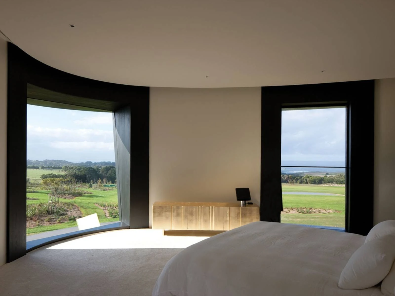
“It’s the fluid aspect of looking at the ocean and waves that describes for us the formal language for this house,” explains Wood. “As with Acca [Australian Centre for Contemporary Art in Melbourne, an earlier Wood/Marsh project], our interiors and exteriors work completely; it’s not just a shell you fit out so there is connectivity to the landscape. Part of the cursive non-geometry of the form goes into the roof and leads to the only room on the first level, then flows around and is visually smoothed out – the chiaroscuro effect amplifies the form. the section is a celebration that takes you up to a very intimate space.”
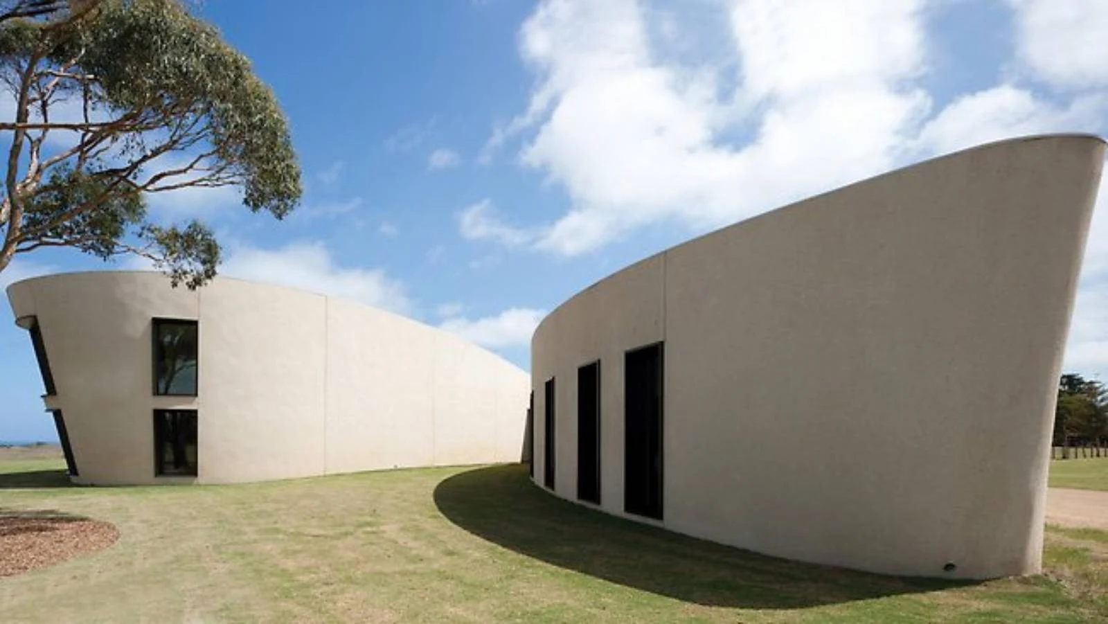
Wood describes the house in direct terms: “This house was never meant to be a holiday house. the brief was that it should be expansive enough to accommodate the clients’ large extended family gatherings and yet be intimate enough for two people to visit.” Often restricted in the realm of residential projects, Wood/Marsh here achieves a new sophistication in the use of spatial geometry. This building harks back to the practice’s iconic Gottlieb House of some twenty-odd years ago, where the compression and release in space served to move beyond a simple reading of sculptural geometry and loaded the volume with the impact of program, a diurnal quality of light and the activated qualities of raw material.
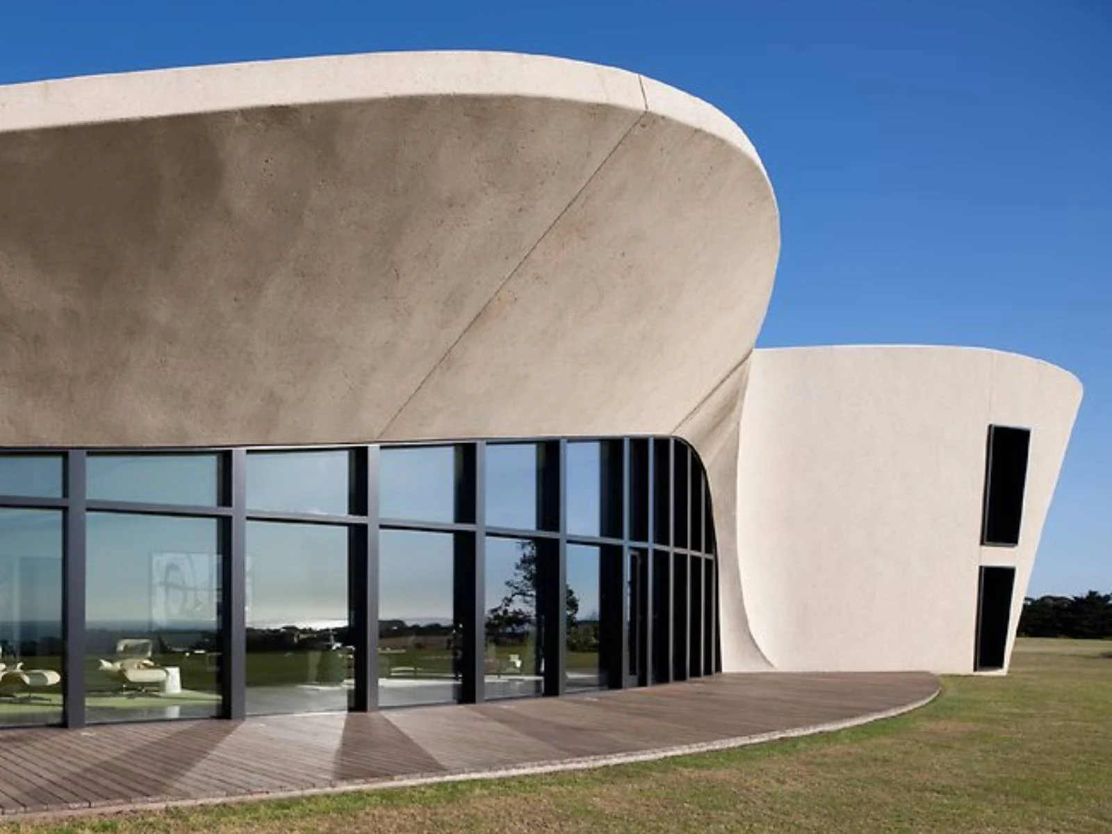
Programmatically the southern wings hold the family, with children’s bedrooms and a playroom off to the compression of the western end and the master suite and adult areas in the soaring east. the other wing holds guest rooms to the east with their own private vistas and amenities and services to the west. What is striking here is the use of material. Fundamentally this is a single-storey house (albeit a large one) with rendered, double-brick walls, a concrete floor and timber windows, but the simple materials are pushed to a new layer of refinement. Wood enthuses that he originally described to the contractor that the sand and cement render should look “just like you’ve taken a photograph of your mother’s porridge cooking when you were a child.”

This is read in contrast to the battened undulating timberwork and demonstrates a level of craft and elegance that is “not manufactured but made.” It is this dexterity and clarity of the rules of the architecture within which Wood underwrites the practice’s position: “Randal and I are very confident in drawing shapes with a simple pencil and enclosing a program to define the architecture … the refinement of the architecture occurs through the resolution of that program.”

Location: Rosebud, Australia Architect: Wood/Marsh Architecture Year: 2012 Photography: Jean Luc Laloux