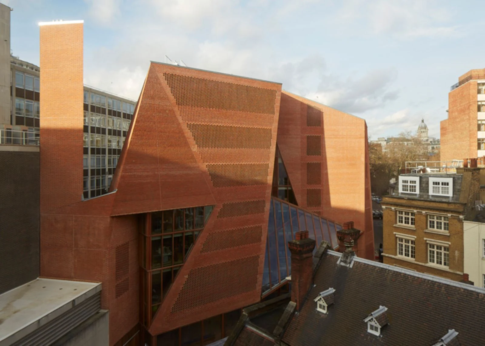
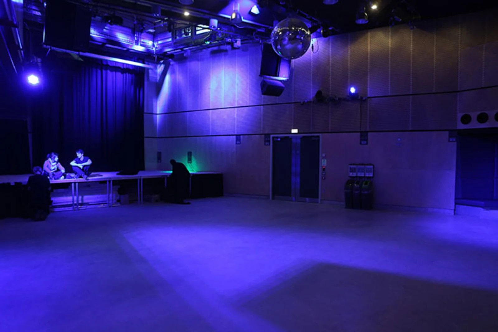
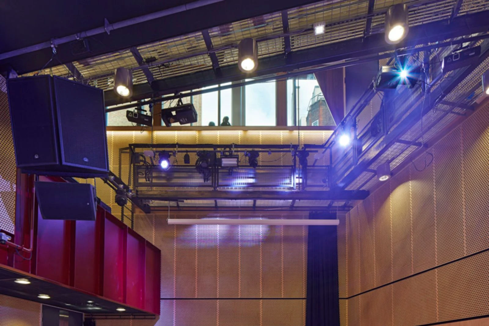
The brief was to bring student facilities together under one roof. the multi-functional building includes a venue, pub, learning café, media, prayer, offices, gym, careers, dance studio and social spaces.
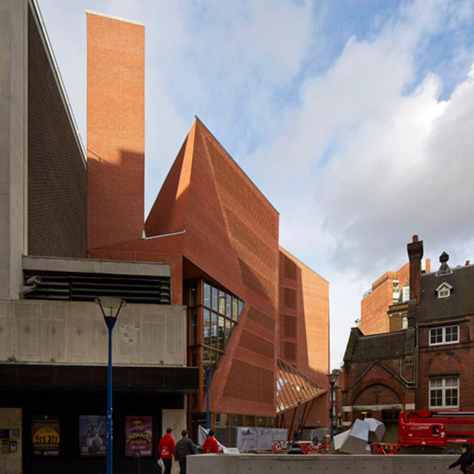
The brief asked for the "best student building in the UK " and had the aspiration for Breeam Excellent rating. the design achieved Breeam Outstanding. he site lies within the Strand Conservation Area. the context was complex and the site was restricted by surrounding building lines.

Specifications were closely monitored by Westminster planners, who supported the ambition for a contemporary design integrated with its setting. Throughout the building process, the planners maintained a commitment to the enduring quality of carefully crafted construction.
The site is located at the knuckle-point convergence of narrow streets that characterise the LSE city centre campus. the faceted facade operates with respect to the Rights of Light Envelope and is tailored to lines of sight, to be viewed from street corner perspectives and to make visual connections between internal and external circulation.
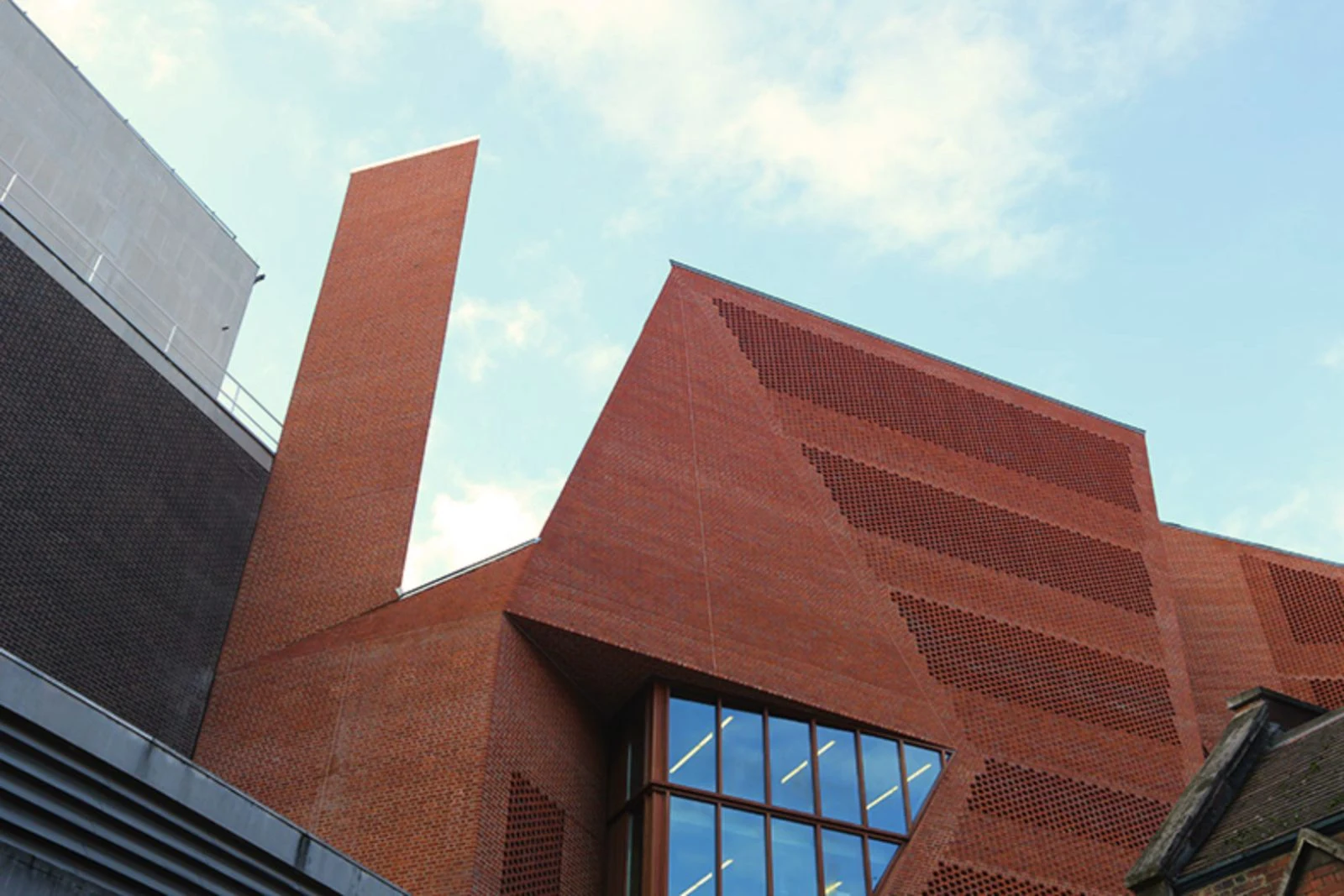
The brick skin is cut along fold lines to form large areas of glazing, framing views. Analysis of the context has influenced the first principles of a site specific architectural design. the building is designed to embody the dynamic character of a contemporary Student Centre.
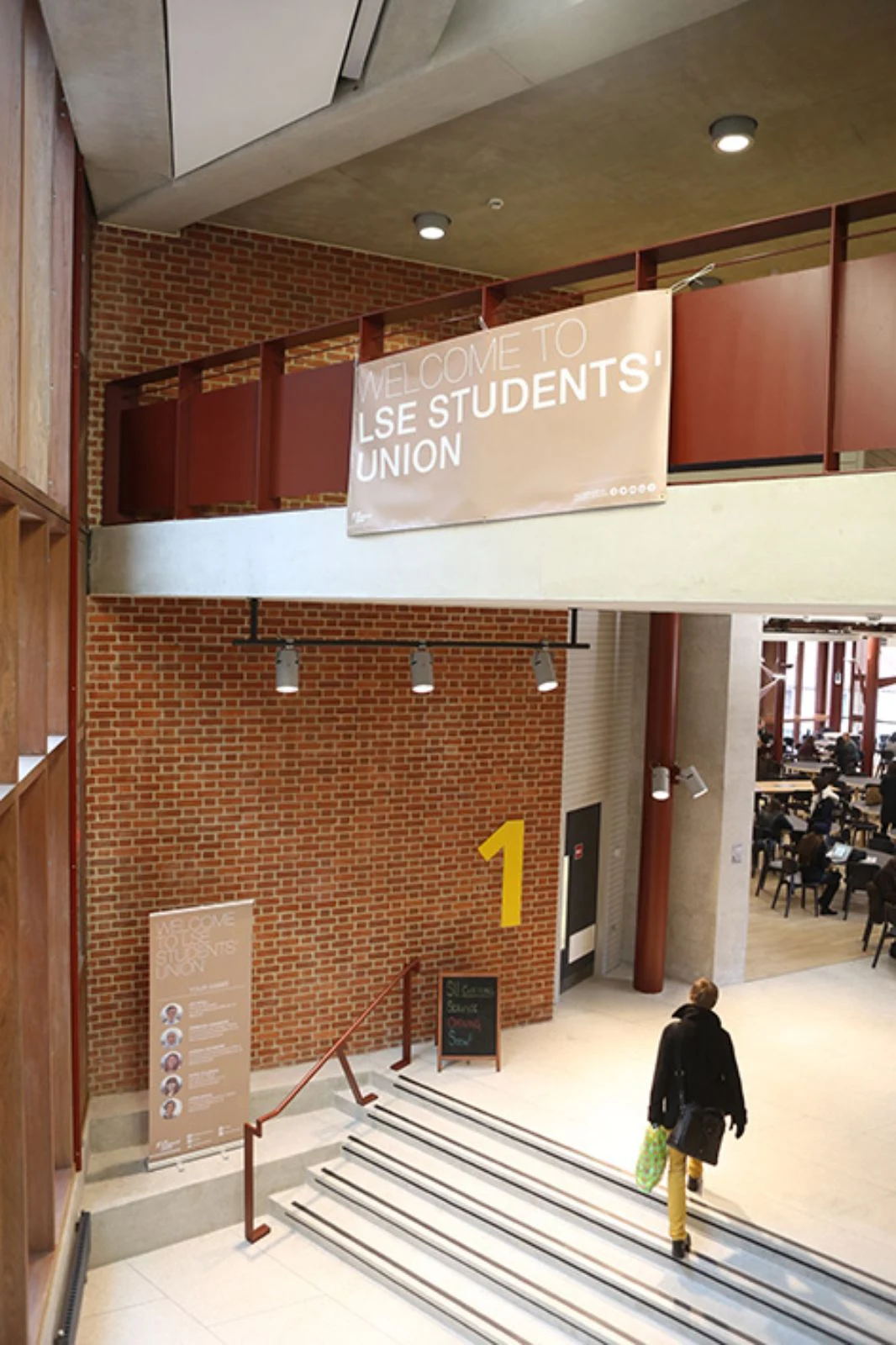
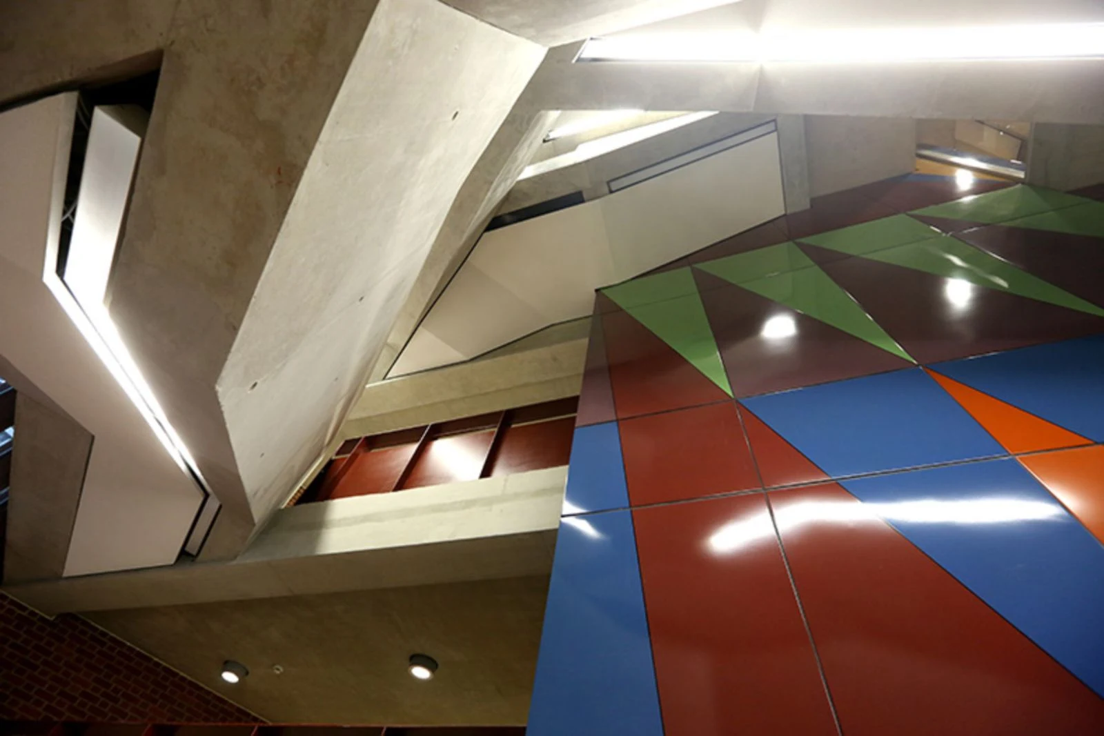
The complex geometries of the site provided a starting point for a lively arrangement of irregular floor plates, each particular to its function. Space flows freely in plan and section, with stairs turning to create meeting places at every level.

London is a city of bricks. the building is clad with bricks, with each brick offset from the next in an open work pattern, creating dappled daylight inside and glowing like a lattice lantern at night. the building has the robust adaptability of a lived-in warehouse, with solid wooden floors underfoot.

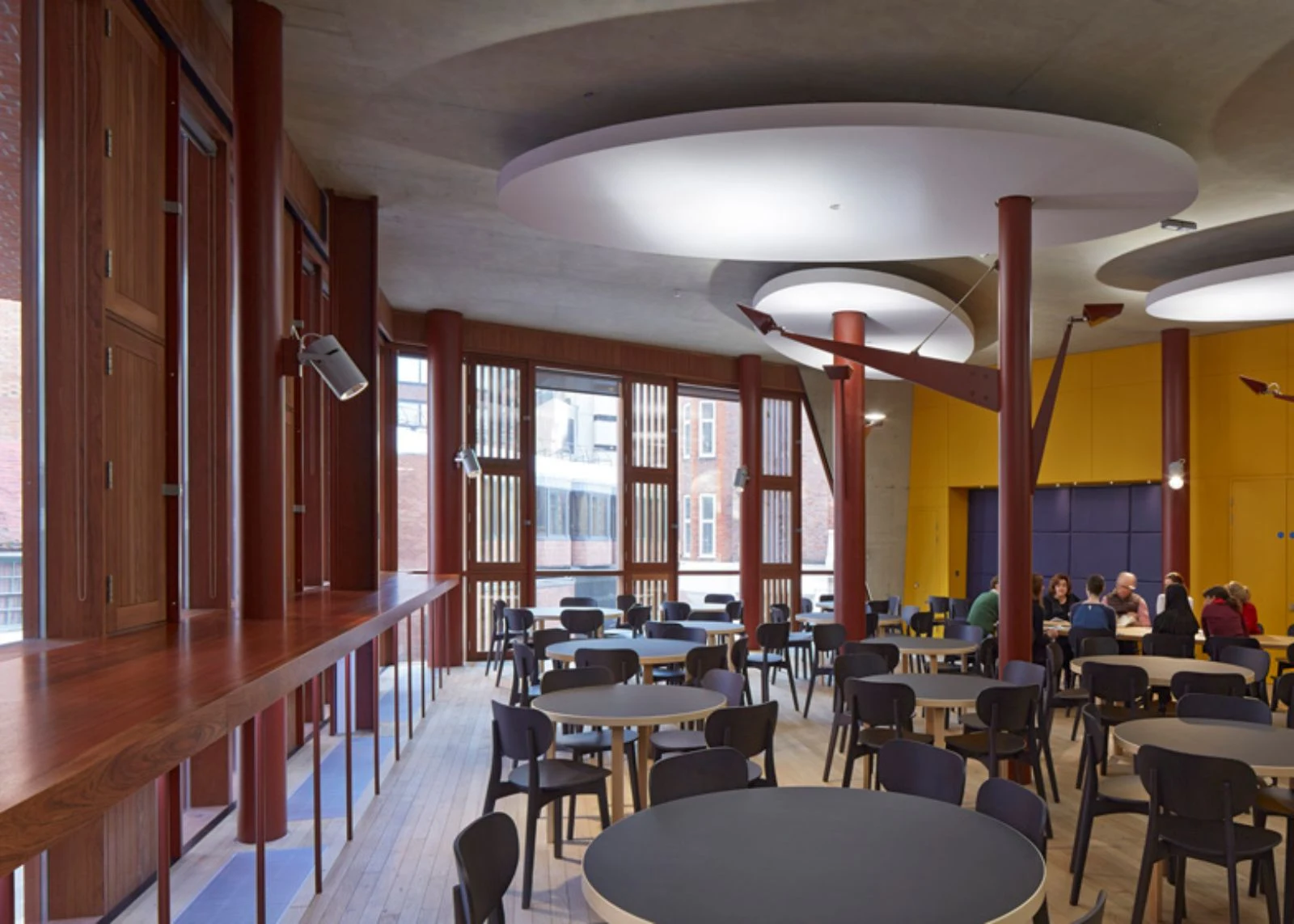
The structure is a combination of reinforced concrete and steelwork. Steel trusses or ribbed concrete slabs span the big spaces. Circular steel columns prop office floors between the large span volumes and punctuate the open floor plan of the café. Concrete ceilings contribute thermal mass with acoustic clouds suspended to soften the sound.

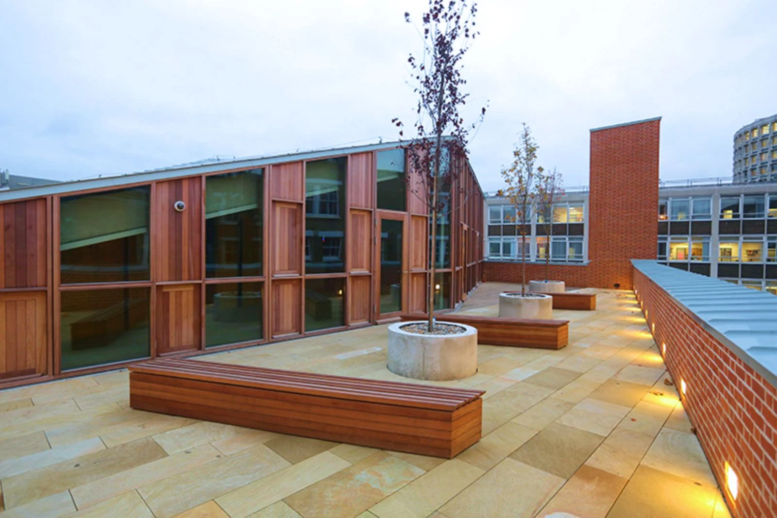
There are no closed-in corridors. Every hallway has daylight and views in at least one direction. Every office workspace has views to the outside world. the basement venue is daylit from clerestory windows. the building is designed with accessibility and inclusive design as key considerations.
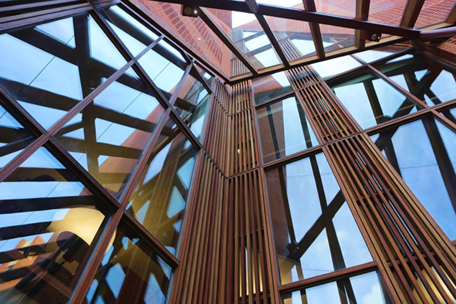
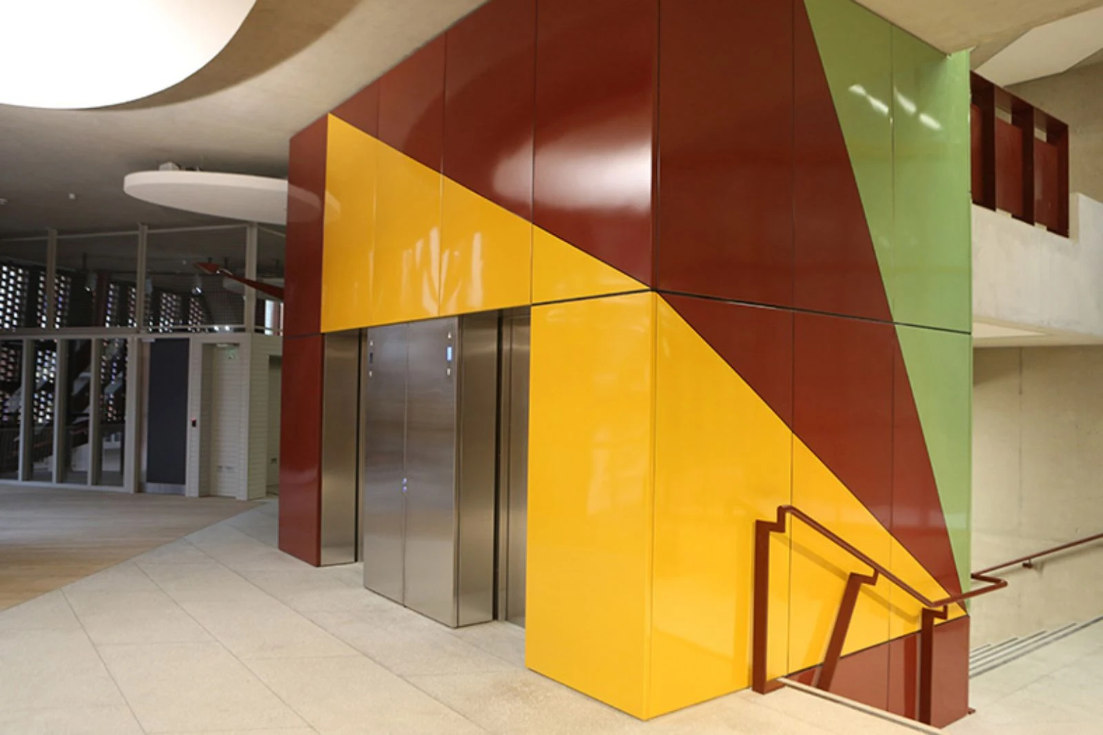
Approaches are step free. Floor plates are flat without steps. Circulation routes are open and legible with clearly identifiable way-finding. Services are located at consistent locations. the central wide stair was carefully designed to comply with standards and details agreed with the approved inspector.






Location: London, UK Architect: O'Donnell+Tuomey Architects Structural Engineer: Dewhurst Macfarlane and Partners/Horganlynch Services + Environmental Engineer: Bdsp Security / Fire / Acoustics / Transport & Logistics / Venue: Arup Archaeology: Gifford Project Manager: Turner & Townsend Quantity Surveyor: Northcroft Planning Consultant: Turley Associates Party Wall Consultant: Anstey Horne Building Control Consultant: Carillion Cdm Coordinator: Gardiner & Theobald Main Contractor: Geoffrey Osborne Limited Size Gia: 6,100m Year: 2013-2014 Client: London School of Economics Photo: Saw Swee Hock Student Centre