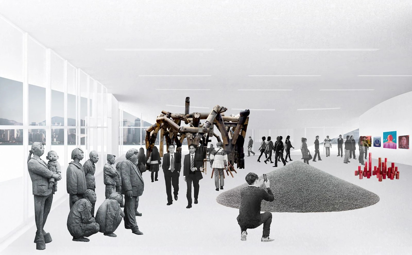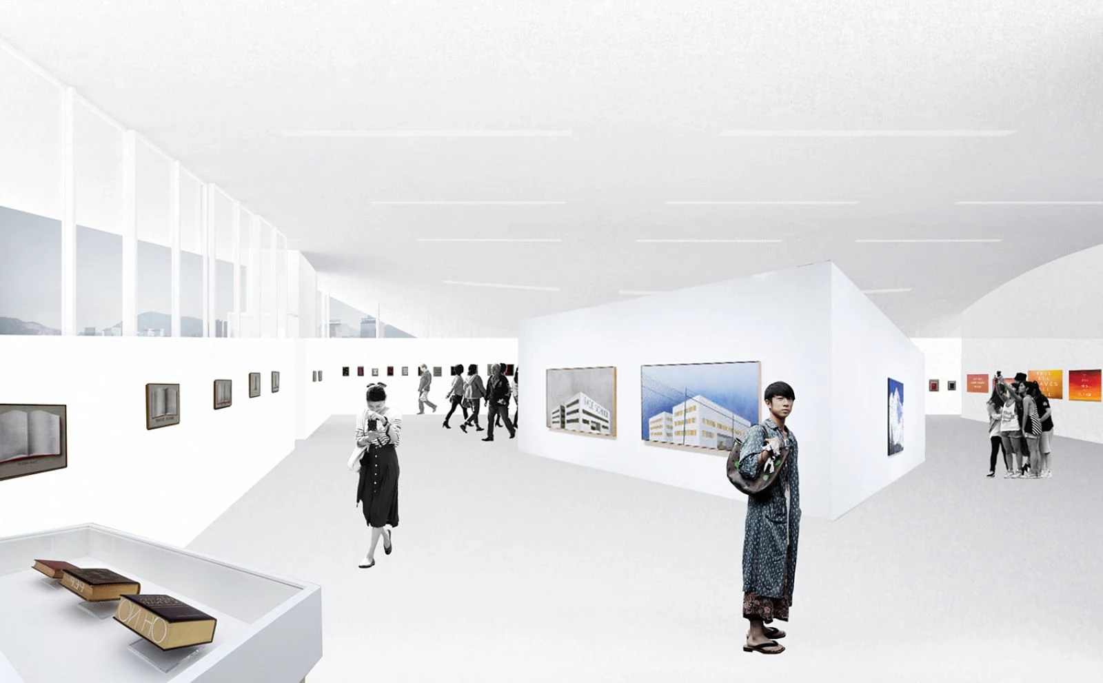
For the West Kowloon Cultural District in Hong Kong, XML designed a new Arts Pavilion. by reimagining the classical Miesian pavilion typology of a glass box and roof, the XML proposal sets out to create a pavilion that offers two distinct types of exhibition spaces.

Under a large canopy, a glass-enclosed box offers a 4.5meter high unobstructed space, that can be adapted to an infinite amount of layouts for the exhibition of painting, sculpture, video, photography and other media. the northeast corner of this glass façade can slide open, allowing the exhibition area to be extended outdoors towards the future M+ Museum.

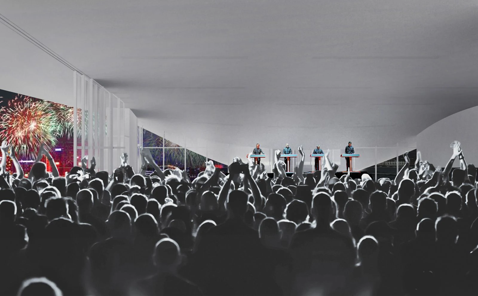
On the waterfront, the canopy slopes downward and becomes a public ‘art square’ as a second exhibition space. This square connects to the water as a welcome differentiation of the waterfront promenade. From here, the steps onto the roof create a small amphitheatre offering views to Central and Victoria Harbour, as well as an elevated platform for exhibiting outdoor art.

In this way, the pavilion can accommodate art in all its disciplines: whereas the inside space lends itself primarily to the visual arts, the outside space can also be a platform for time-based arts such as performance, theatre, music and cinema. the required secondary program of office, storage and toilets is organized in a long rectangular core that is located towards the west side of the building.

This volume along the west façade and the slope of the roof on the south side block direct sunlight from the gallery, creating good conditions for exhibiting art as well as significantly reducing the need for cooling. in addition to the glass walls, a grid of lighting boxes for ambient light is integrated in the roof with adjacent tracks for Led spots, allowing for maximum flexibility in exhibition lighting plans.

The large roof of the pavilion has been designed as an in-situ reinforced concrete slab supported by a number of irregularly placed components for structural support: the long wall on the east side of the space that is part of the consolidated box of secondary program, an L-shaped structural element near the main entrance and a single large column that includes a Jenny Holzer-inspired Led band of lights, announcing the pavilions’ program.

Accordingly, through a minimal and mostly hidden structure, the design offers an unobstructed space open for experimentation and production. the floor and ceiling finishings have deliberately been proposed as industrial inexpensive materials so as to allow curators to drill, paint or nail at will. the potent yet simple shape together with the wide array of possible configurations for exhibiting art will give the pavilion prominence in the large new development of the Wkcd.

Here, the architecture of the pavilion serves art by adding public space to Hong Kong’s urban life and by bringing together different audiences. Hence, the pavilion – A² – is not only a place for experiencing art, but also a place that offers a new perspective to contemplate and reflect the city itself.
Location: Hong Kong, China Architects: XML Collaborator: Stefan Al Local Architect: Agc Design Ltd Structure, Installations, Sustainability: Arup Hong Kong Cost analysis: Sweett Group Size: 470 m2 Gfa Client: the West Kowloon Cultural District Authority (WKCDA)